The vault
The cases that occupied us prior to the launch of Studio WillemsPeeters
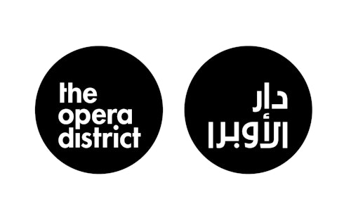
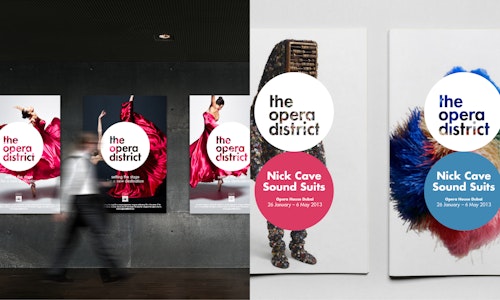
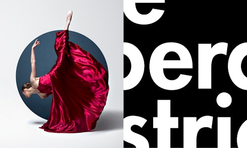
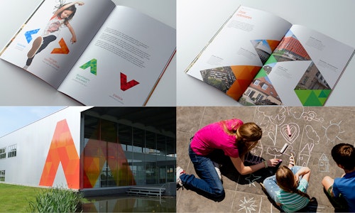
The Opera District Area in Dubai (by Emaar, one of the largest real estate developers in the UAE well known for various large-scale projects such as developing Burj Khalifa, the tallest building in the world) brings together the new arts and culture movement in the Middle-East. The circular area is the new epicenter that stimulates creativity, supports the arts and offers visitors the choice of hospitality and leisure.The logo reflects the area and functions of the new epicenter of arts and culture in the world. It’s pure shape can hold every different form of art. It is the new platform for creativity. Identity developed at Duval Branding.
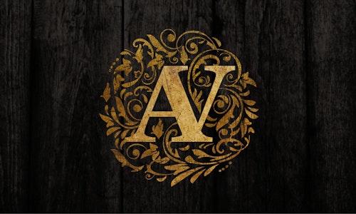
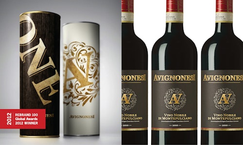
Avignonesi is a well-known Vino Nobile di Montepulciano estate in Tuscany. Their Vin Santo is one of the most famous wines in Italy. New owner Virginie Saverys wanted her ideas on reading and respecting the genuineness of the Montepulciano terroir to shine through in all Avignonesi communications.We developed the communication idea that “genuineness” is central to Avignonesi. Underlining that Avignonesi is a wine that will give great rewards to those who are willing to invest themselves (producers as well as wine lovers). The new wines, in their totally revised packaging, have been very well received by wholesalers. The Avignonesi rebranding has been granted the coveted ‘Best of’ in the 2012 Rebrand®100 Global Awards. The Avignonesi rebranding has also been awarded as best identity in ‘Design from the best 2012’.
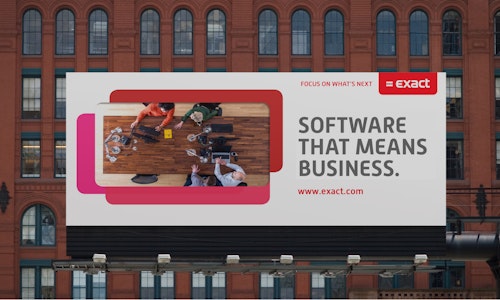
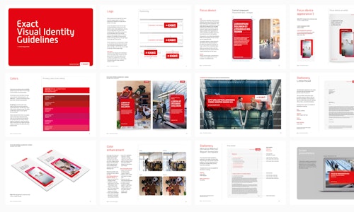
As Exact Software and its services have significantly evolved over the last few years, a clear update of the brand message and identity were put on the agenda. Exact Software teamed up with us again, to come up with a new claim ("Focus on what's next."), a revised visual brand identity and a new, extended set of guidelines and communication materials. Work done at Duval Branding.
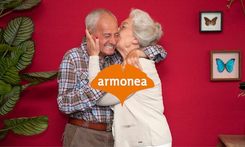
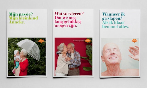
Armonea is the leading independent elderly care service provider in Belgium. Spread across some 85 nursing homes, service flats and service residences throughout Belgium, its 6,400 elderly care staff create a home environment for more than 10,000 senior citizens on a daily basis. Armonea felt their 35th anniversary was the right time to expand its brand reach. Duval Branding was approached to help devise a strong brand positioning as well as the corresponding visual language. Armonea's unique philosophy of 'positive aging' was used as a stepping stone for the new branding. All channels of communication are assessed based on this philosophy and fleshed out according to the newly developed guiding principle of 'there's no age limit on happiness'. Work done at Duval Branding.
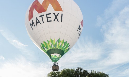
We've created the new overall communication strategy 'Welcome to the neighborhood' for the belgian real estate developer Matexi. Instead of building houses, Matexi profiles itself as a developer of neighbourhoods, where people can live, enjoy their free time, go to school, practice sports, shop, ... . The new identity emphasizes all the different aspects inside a neighborhood and the ability of creating your own 'patchwork' of things that make your neighborhood a great place to live. Work done at Duval Branding.
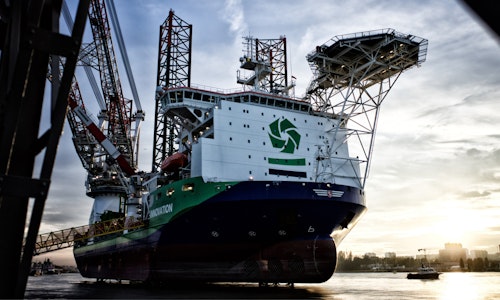
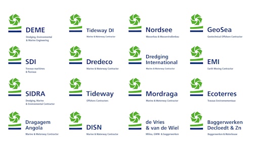
DEME is a Belgian world leader in dredging, land reclamation activities and hydraulic engineering. In the last decades, the group has grown considerably, adding new companies to the group as well as new services to its offering. We developed 'Creating land for the future' - that allows the DEME Group to communicate in a clear and convincing way. A consistent visual identity, plus identity guidelines for key applications forms the basis for an extensive range of communication tools. Work done at Duval Guillaume.
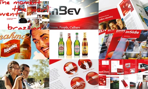
When two of the biggest brewers (Interbrew and Ambev) decided to merge in order to become the world's most important brewer, an extensive communication platform (think local, act global) a corporate identity and a worldwide image bank (for which we conducted photoshoots around the world) were needed. Work done at Duval Guillaume.
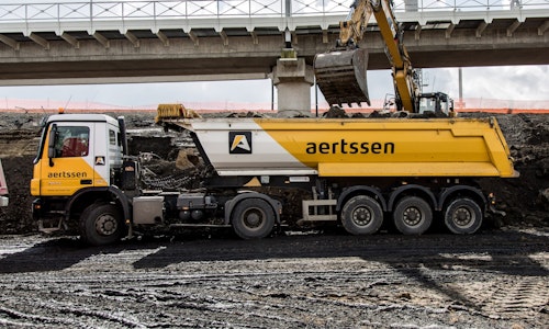
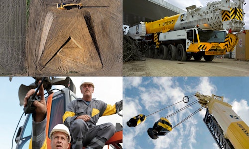
Aertssen, a Belgian market leader in infrastructure work, with integrated services for lifting work and transport, needed to evolve from a 'family company' into a nationwide respected brand. Serious rebranding turned out to be a necessity as their existing identity felt stale and out-dated, not at all reflecting the technically advanced, flexible approach of the company. Moreover, their brand architecture had to be made more customer-focused and their services had to be united under one over-arching theme. Work done at Duval Guillaume.
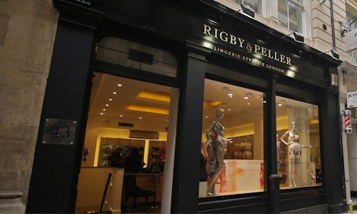
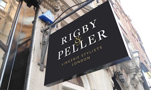
Based upon the brand story, a new identity of Rigby&Peller was created(London based lingerie retailers offering bra fitting and made to measure lingerie collections including mastectomy bras, briefs, cup sized swimwear, bridal lingerie and corsets). Next to the visual identity, a number of items were created to emphasize the new brand story 'I came in for a new bra and left as a new woman'. We also worked on the european and asian shop interior designs. Work done at Duval Guillaume.
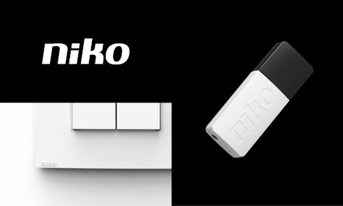
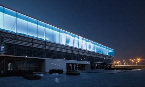
Niko designs electr(on)ic solutions to enhance buildings to better suit the needs of the people who live and work in them. By using less energy, by improving light comfort and safety and by making sure all applications work together seamlessly. Buildings with Niko are more efficient, are controllable from a distance and interact within bigger ecosystems. Niko is a Belgian family business from Sint-Niklaas with 750 employees and 10 European branches. Work done at Duval Guillaume.