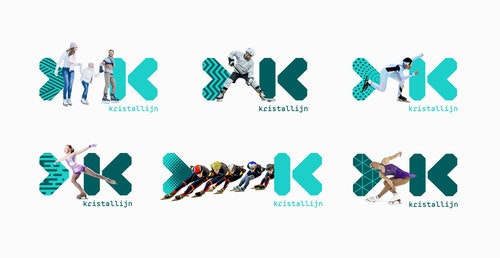
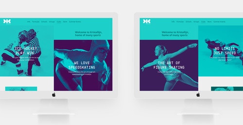
Kristallijn — Home of ice skating sports
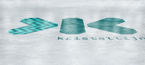
Kristallijn (Ghent based) is the biggest ice rink in Belgium. We were tasked with creating a new identity that was an evolution of the current brand, but was redesigned to better express the vibrant energy of the ice rink.
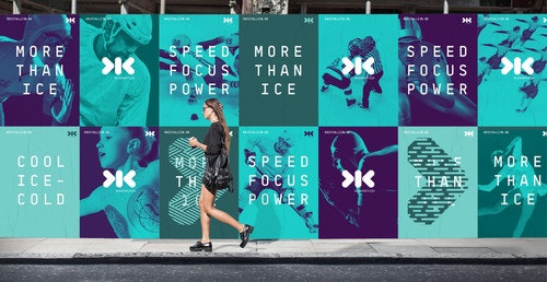
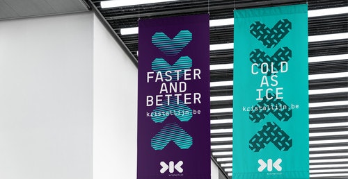
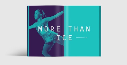
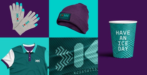
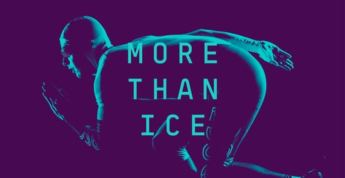
'More than ice' is about offering people the best moments in their free times. It's about hosting a big range of ice sports at a high level that already produced many top athletes. It's also about organizing special events for companies, schools, groups,…. Ice skating is so much more than just skating. Kristallijn offers its customers moments to relax, socialize, enjoy, taste, discover and celebrate,… . Even when skating season is over, Kristallijn is also the perfect location to host concerts, parties, marriages, teambuilding events,….
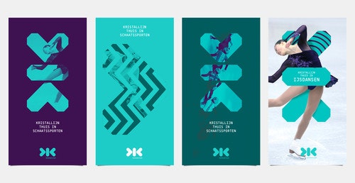
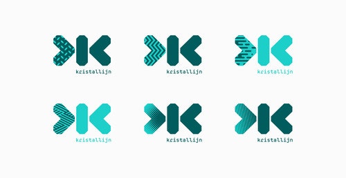
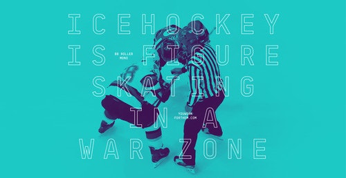
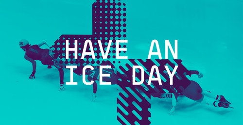
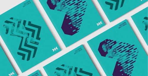
The new brand is expressive, fun, spontaneous and strives and stretches across any platform of communication. The rebrand speaks to a very broad audience, sporters, enthousiast, young and old.
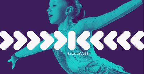
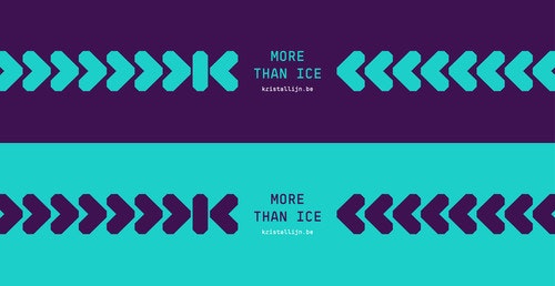
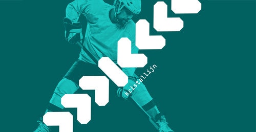
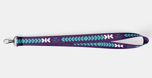
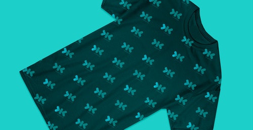
The pattern layer adds complexity and modernity to the brand. These bold patterns are graphic, and energetic- inspired by the movement of ice skaters. As part of the new brand we developed an bold and expressive colour palette. The typography, graphical patterns, imagery and the Kristallijn mark all work harmoniously together, creating a distinctive graphic language.
'The goal was showing that ice skating is our core business, but that there is so much more to explore at Kristallijn. Fourteen days later Studio WillemsPeeters presented their view and design which completely blew us away. 'More than ice' was born!' — Jonas Vercruyssen, owner