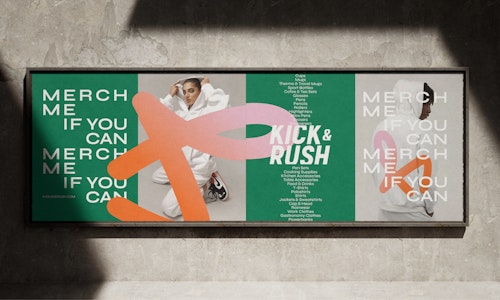
Kick&Rush — Your brand matters
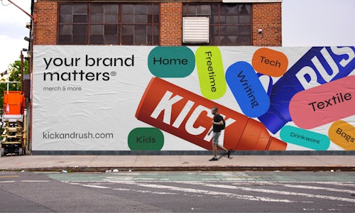
Kick&Rush is a company that specializes in providing branded merchandise solutions. They offer an end-to-end service, handling everything from the creative concept to the delivery of customized items. They also set up web-shops for brands, allowing for 24/7 accessibility and tracking of key data points. Kick&Rush has worked with prominent clients like Toyota, L'Oréal, and Daikin.
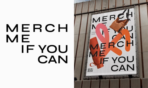
Kick&Rush asked us to refresh their existing brand and establish a clear and consistent style across all their communications. As they were dealing with many different types of imagery (cutouts, products in situ, lifestyle,…) we need a simple and flexible system to maintain coherence. We developed a system to ensure a unified look, despite the diverse visual inputs. This approach helped create a seamless and consistent brand presence across all their materials.
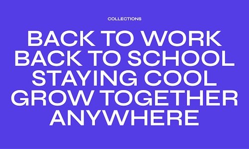
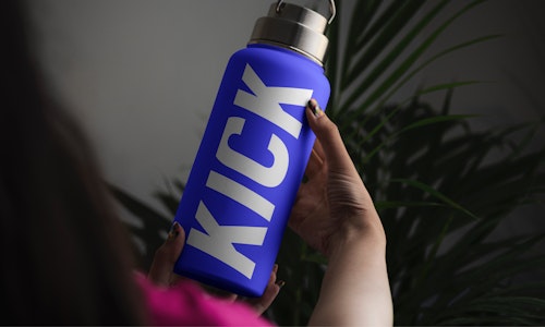
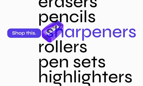
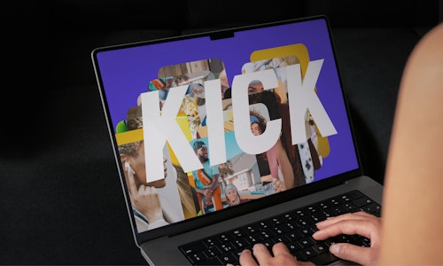
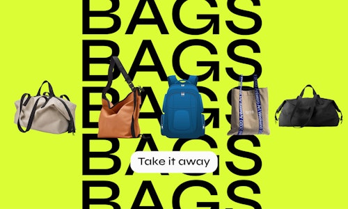
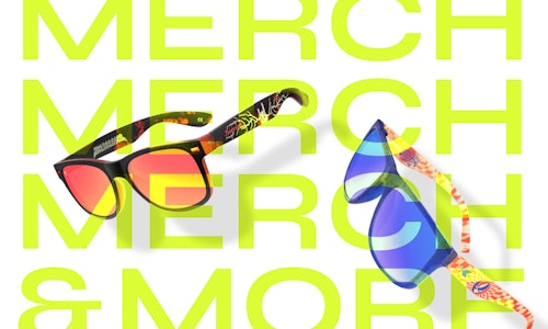
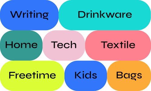
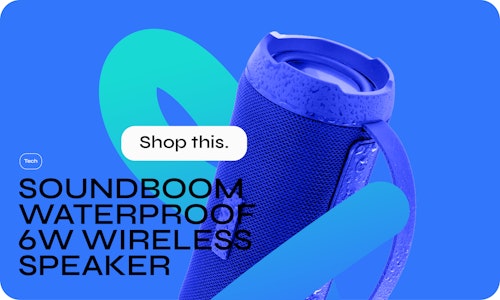
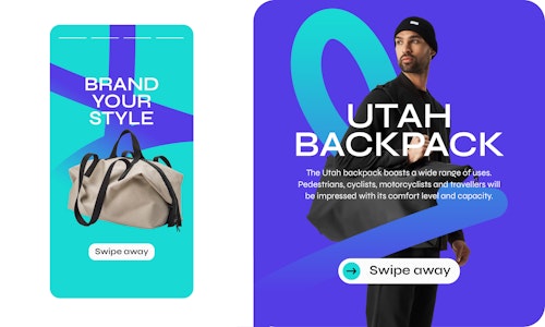
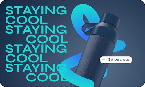
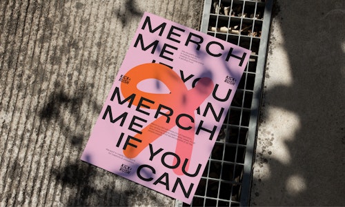
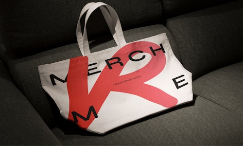
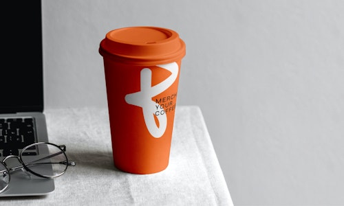
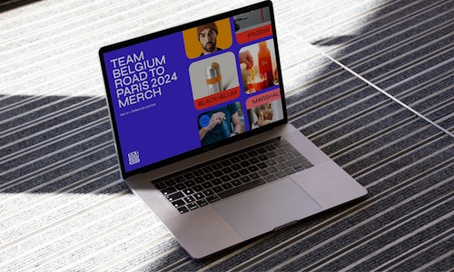
For Kick&Rush, we refreshed their existing logo, introduced a brighter colour palette, and implemented a new font family that when getting bolder, the typeface also gets wider. We also designed a masonry grid system that places elements in the optimal position based on available vertical and horizontal space, ensuring a coherent look across their diverse range of imagery. This approach helped unify their brand presence and enhance the consistency of their communications.
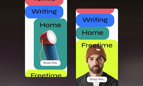
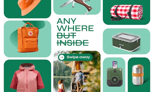
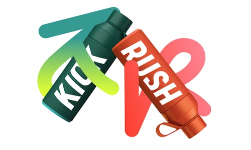
To install the customization of its products, a system of dynamic swirls was added to emphasize the brand's unique identity and enhance visual appeal. These swirls adapt to various formats, creating a cohesive and eye-catching design across all communications.
