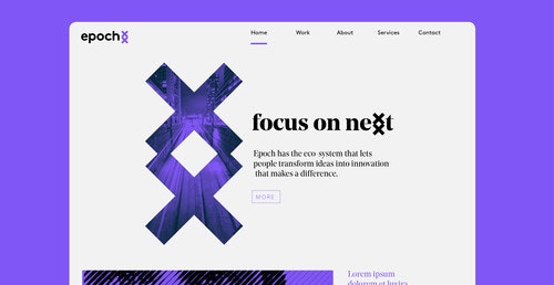
Epoch — focus on nexxt
Open Banking and business innovation are this year’s hottest topics. Virtually every financial institution in the world is somewhere on the journey to transform the way they operate and how they serve their customers. Epoch is a group of ambitious and focused pioneers, working for financial services with adjacent markets. Their focus lies on solving complex innovation challenges through the design of new state-of-the-art technologies.
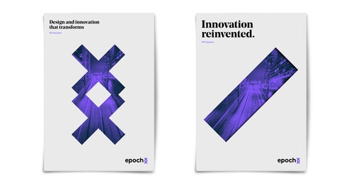
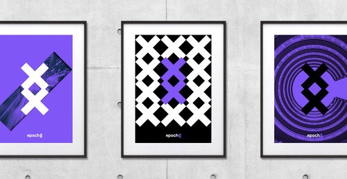
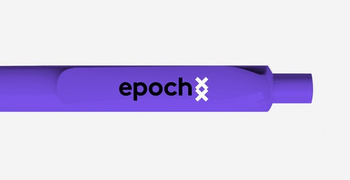
The logo symbol is derived from old Viking symbolism. The symbol Inguz, meaning 'where there's a will, there's a way.' It often denotes fertility of mind, or the motivation and energy needed to start new projects. A new job is often indicated when this rune is drawn, but even if this does not occur, the potential remains for considerable change for the better.
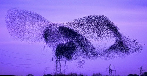
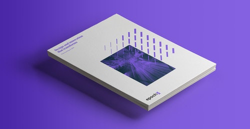
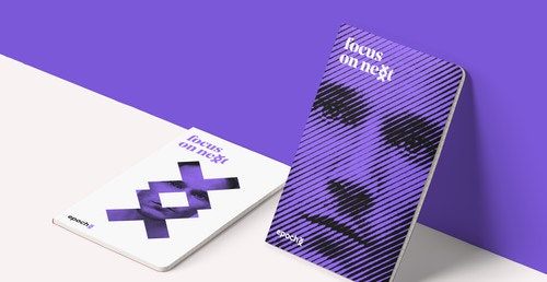
The changes in the financial world are going fast and furious. The rise of FinTech has huge implications for the financial services industry, and all of us who use any form of money. Epoch's eco-system brings the core building blocks of FinTech innovation together, provides challenges and directions, and then evolves new solutions. Epoch's visual style is derived from the murmuration of birds, an ever evolving system of digital patterns. Creating a sense of motion and dimensionality from a static form.

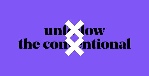
As Epoch is a leader in its field, we wanted their messages to be bold and visually strong. therefore we opted to use a bold typeface.