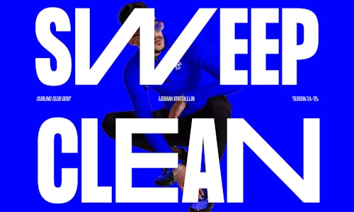
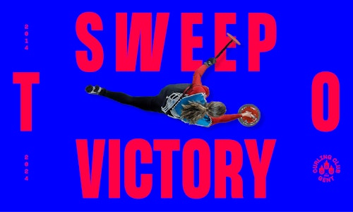
Sweep to victory
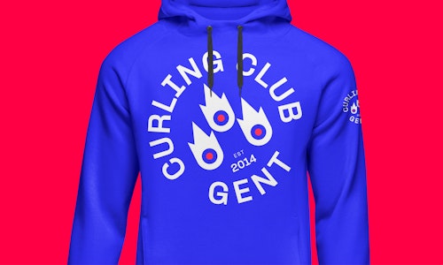
Curling Club Gent, founded in 2014, has grown into a vibrant community with around 50 dedicated members. Curling, often described as “chess on ice,” is a team sport where players slide stones across the ice towards a target. To attract more people to this exciting and inclusive sport, we were asked to do a rebranding of their current identity. Our visual approach aims to bring more visibility to curling and engage a wider audience.
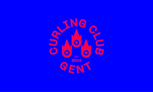
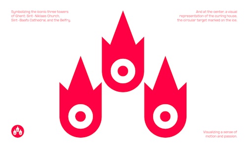
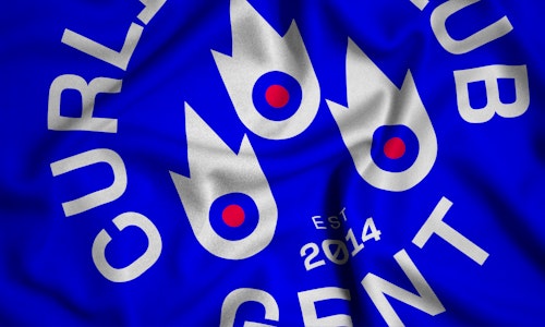
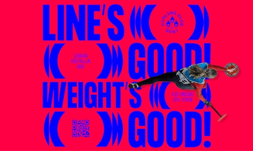
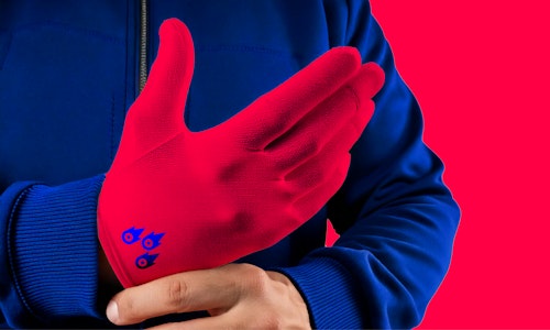
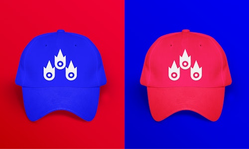
We chose to emphasise the club’s proud connection to Ghent by drawing inspiration from the city’s iconic three towers. This foundation allowed us to create a stronger visual identity that blends heritage with energy. The redesigned icon captures the dynamism and passion of the sport, while incorporating the symbolic circular target from the curling field. The result is a bold, modern emblem that reflects both the club’s origins and its forward-looking spirit.
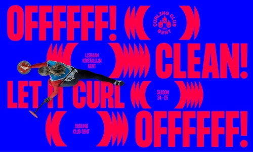
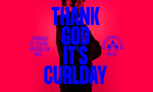
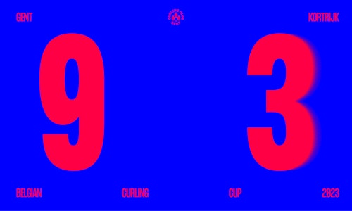
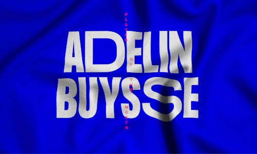
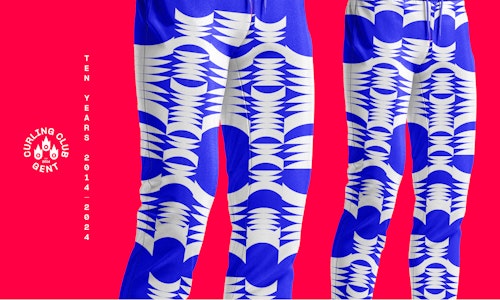
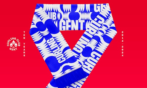
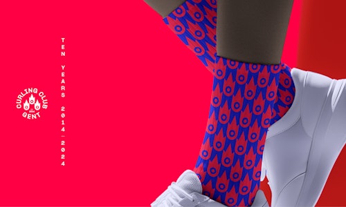
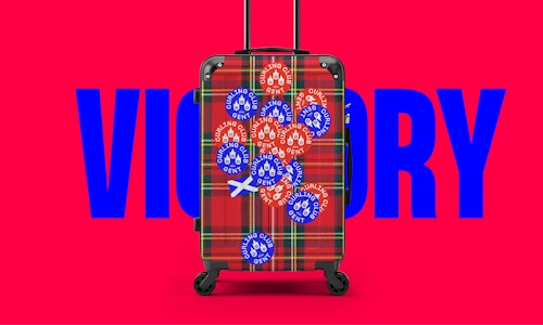
We chose a bold and vibrant colour palette. The blue reflects the club's heritage, while the red symbolises the lines on the curling field. The strong typography captures the energy, power, and forward momentum of curling. By opting for a small and streamlined set of assets, Curling Club Gent can quickly create impactful visuals and updates on their social media.